In order to start working on my character designs, i created some character sheets to show Florence with different expressions, and from different angles. As i am drawing Florence from 3 different ages in her life, i have created 3 character sheets to explore these individually, in depth. Not only did i focus on poses, expressions and angles, but i also began to look at outfits. I included a full body shot on each sheet in order to see what my characters faces will look like when combined with a traditional outfit from the time period and i feel that this was a really successful idea as it made it a lot easier to replicate and re pose Florence later down the line, without starting from scratch. Colour choices directly referenced from children's clothing during one 1820’s- Lots of light pastel tones in pinks, blues and greens. Using the baby pink and baby blue to reflect her age as these colours are more so linked to younger children. Colours became more muted in the 1...
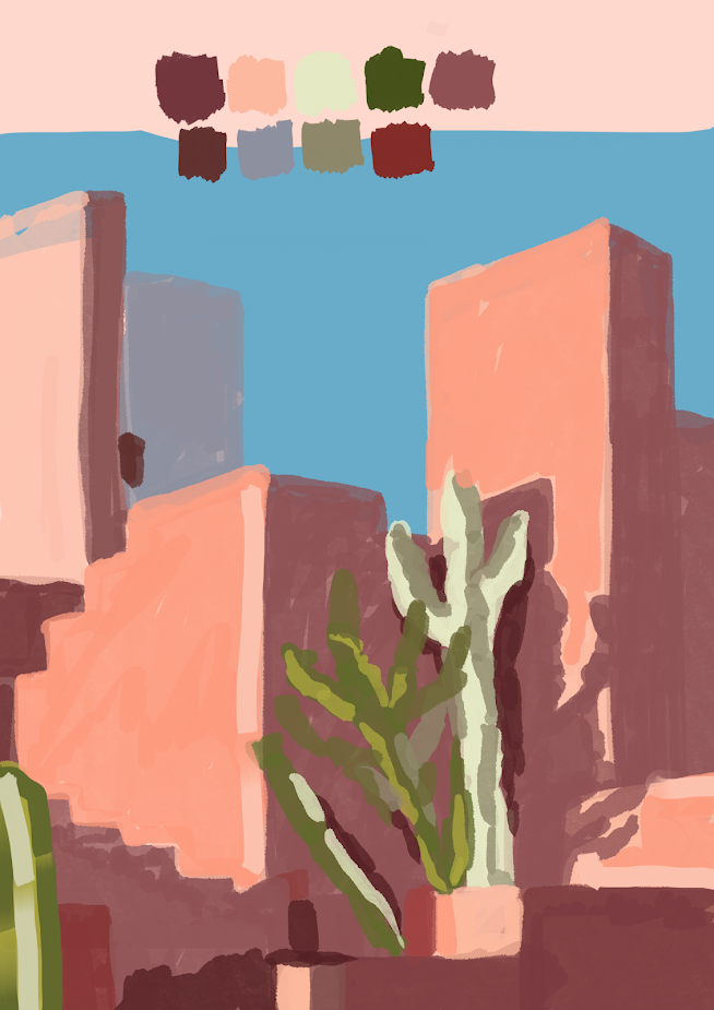
During this session, we focused on shadows, looking at how different ranges of lighting effects the shades and the colours within our work. Putting this idea into play, i created the piece below. I took the reference photo and sampled 9 different shades from it which allowed me to construct my copied image as the shades ranged from the darkest darks to the lightest highlights. Using these, i mapped out all of the areas without using any line art in order to show which aspects were shadowed, which were highlighted and which sat in the middle ground. I chose to use a brush with a low opacity to do so as i felt the layering of colours created a much more realistic effect. I put down some lighter tones first especially seen on the buildings, then over lapped a darker tone of the same hue in order to build the colour up yet leave some of the highlights peeking through. This was a really fun and interesting experiment as it allowed me to see the image for its tones, rather than t...
This is the reference photo that i used for my paintings. I mapped out the middle, fore, and backgrounds so that it would be easier to put my tones in when painting. I created this piece using the theory that the values in the image get lighter as they reach the background. I kept the background scale very short with only three values and had the foreground section with the biggest range. I really liked this method of painting- making the background the lightest values gave an almost foggy effect to the painting as well as giving it depth which i really like. I did however, struggle to get all of the detail in on the background with such a small range of tones so this is perhaps something i could experiment with moving forward. For this painting, i kept the same range of values (smaller amount in the back, more towards the front) but changed the values within them. I introduced darker tones to the background which i feel really allowed me to get more detail into the painting, unl...


Comments
Post a Comment