Shadows
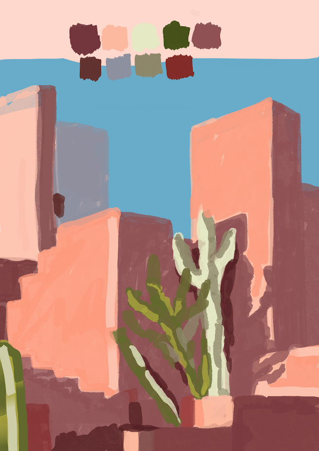
During this session, we focused on shadows, looking at how different ranges of lighting effects the shades and the colours within our work. Putting this idea into play, i created the piece below. I took the reference photo and sampled 9 different shades from it which allowed me to construct my copied image as the shades ranged from the darkest darks to the lightest highlights. Using these, i mapped out all of the areas without using any line art in order to show which aspects were shadowed, which were highlighted and which sat in the middle ground.
I chose to use a brush with a low opacity to do so as i felt the layering of colours created a much more realistic effect. I put down some lighter tones first especially seen on the buildings, then over lapped a darker tone of the same hue in order to build the colour up yet leave some of the highlights peeking through. This was a really fun and interesting experiment as it allowed me to see the image for its tones, rather than the lines that it is constructed from. It pulled me away from my typical way of working and allowed me to explore the idea of colour further which is definitely something that ill take forward in my practice.


Comments
Post a Comment