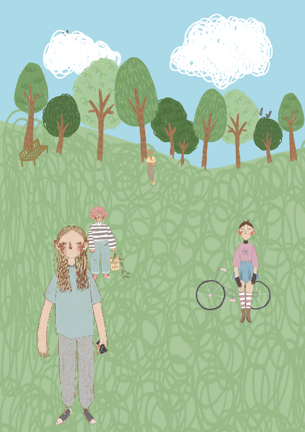
Background- changing eye level and horizon line
In order to create my final scene, i made separate elements first so that i could move them round accordingly- I kept mine simple as to not over crowd the scene.
To create depth, i experimented with changing the scale and positions of my elements- i bought some of my characters forwards and enlarged them so that they looked closer to us, and sunk some of them back so that they looked far away, giving the illusion of a large middle ground which creates depth.
Another example-
I did the opposite on this one, dragging the horizon line up to create an almost birds eye view perspective. This gave me a lot more space, in turn making my characters look smaller which gave the impression that we were looking over them.
Finally, this is just a simple eye level view scene. The horizon line is almost central on the canvas which balances the piece, and the character sit comfortably within this. This makes us feel like we are on the same level as the characters, rather than above or below due to the placement of the horizon line.


Comments
Post a Comment