Lighting changes, time of day
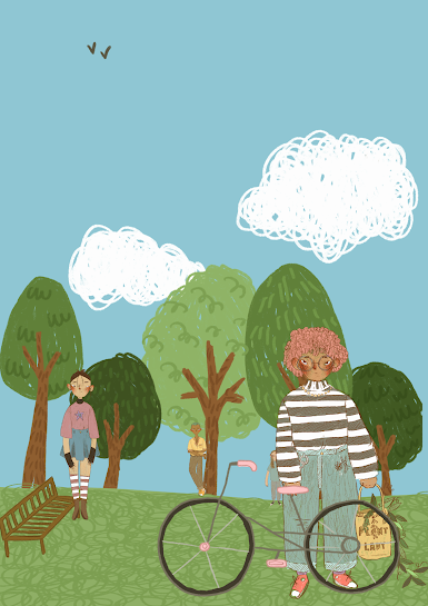
These few images are the outcomes of me experimenting with different colour tools on procreate. For this first image, i used the curves bar (as seen on the screenshot below) to boost the warm tones up in order to give an almost sunny feel to my scene.
I found this feature quite hard to use as the slightest movement dramatically altered the outcome of the piece- I feel that this effect would probably work a little better with a smaller range of colours, unlike my piece here.
Juxtaposing the warm tones above, i wanted to create a cooler toned image. Again, using the curves tool, i boosted the cooler tones in order to create a more gloomy and wintry feel to the scene. I feel that this would have been more successful on JUST the background rather than on the characters too, so that's definitely something to keep in mind for future projects.
I used a different preset gradient map on this image above and although rather abstract and almost fantasy-esque, i quite like the outcome. This preset differentiated the different colours a little better than the last which helped as it kept a lot more of the detail in the image. Again, this perhaps wasn't the best tool for this project but it could definitely come in handy in the future.
Here, i wanted to give the illusion that my scene had sunk into night time. I added an adjustment layer over the top of my image and set it to darken which gave this transparent, darker sheet over top of my original image. I think this was probably the most effective scene as it does feel like it is set later in the day, compared to the first image for example, which feels like its set in the morning due to the warmer colours.
Lastly, i used hue and saturation to alter these two images. Again, much like the gradient maps, these weren't the most successful outcomes but could be useful for other projects. I think this would better used for altering small portions of a more intricate scene as it was very simple to use but on my images in particular, i dont think it gave the best effect.


Comments
Post a Comment